 TVC Helium 2026.3.0
<Toolbar>
    ...
    <TableConfigurator />
    ...
</Toolbar>TVC Helium 2026.2.0 Release Information
01 May 2026
Table of Contents
1. Table
1.1. UIPTable
Helium support UIP table for rendering table data. This release enhanced the UIP table by adding support for built-in <TableConfigurator /> toolbar command.
This command allows adding, updating and removing user defined tables and maintaining End User Column Configurator for different tables.
This command can be configured in UIP table toolbar as below:
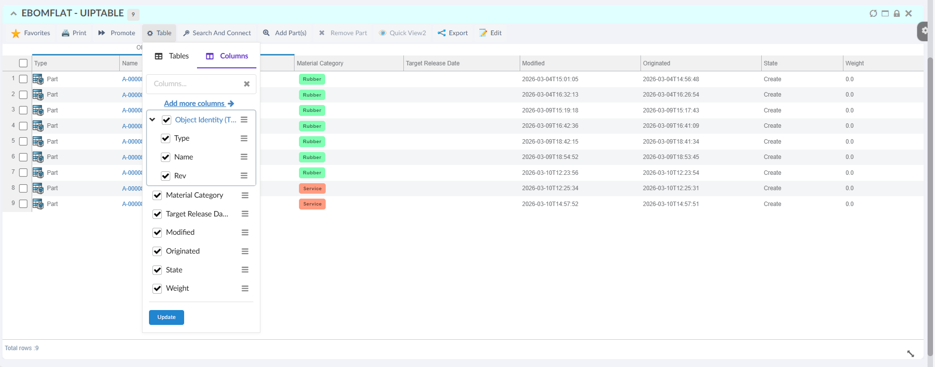
Figure 1. UIP Table TableConfigurator
Read the Table Configurator for more details.
1.2. Scroll position reset on pagination
In a datatable widget, the rows are rendered inside a scrollable content area. When a table contains many rows or columns, users typically scroll within this widget area to view data.
During pagination, users can move to next or previous result pages while still being scrolled somewhere in the current page. Helium can now reset this widget content scroll position to the top so each new page starts from the first visible rows.
Enable this behavior globally by setting the following property in tvc.properties:
tvc.helium.datatable.scroll.enableScrollTopReset=true
Default value is false.
Read more about Table Config for more details.
2. Form
2.1. Relationship Attribute Field
Helium supports creating an object and connecting it to an existing object using form configuration. Form fields can be configured to capture object attribute values during this process.
This release introduces support for relationship attribute fields in forms. This allows users to specify relationship attribute values when an object is created and connected through form submission.
The usesBusinessObject attribute on the Field element determines whether the field refers to a business object attribute or a relationship attribute.
Valid values are:
-
true— The field expression is interpreted as a business object selectable (default behavior). -
false— The field expression is interpreted as a relationship selectable.
Example:
<Field usesBusinessObject="false">
...
</Field>
A Create and Connect form with relationship attribute fields can be configured as shown below:
<Form>
    <Title>Create and Connect Part</Title>
    <Section>
        <Label>Relationship Attribute</Label>
        <Field usesBusinessObject="false">
            <Label>Notes</Label>
            <Expression>attribute[Notes]</Expression>
            <Editable>true</Editable>
        </Field>
        <Field usesBusinessObject="false">
            <Label>Usage</Label>
            <Expression>attribute[Usage]</Expression>
            <Editable>true</Editable>
        </Field>
    </Section>
</Form>
Read more about Form for more details.
3. Grid Browser
3.1. Multi Sort
Grid Browser now supports multi-column sorting, allowing users to sort data by up to three columns simultaneously with independent sort directions (ascending or descending). The sort configuration can optionally be saved for future sessions.
This command can be configured in the grid browser toolbar as below:
<Toolbar>
    ...
    <AdvanceSorting />
    ...
</Toolbar>
Figure 2. Grid Browser Multi Sort
Read the Grid Browser toolbar documentation for more details.
3.2. Data Filter - Multiple Column Filters
The Data Filter in Grid Browser has been enhanced to support multiple column filters. Users can now add multiple filter rows, each targeting a specific column or any field, with operators such as contains, is, is not, is empty, is not empty, and not contains. Filters can be combined with options like Any Expression (OR logic), Full Structure, Match On Every Level, and Show As List to refine search results across the grid data.

Figure 3. Data Filter - Multiple Column Filters
Read the Grid Browser toolbar documentation for more details.
4. Search
4.1. Exalead Search Provider - Optional comma escaping
When search uses the Exalead provider, you can set xl:escapeCommas on a search form field so commas in criterion values are escaped before they are sent to Exalead. Use true when the indexed attribute contains literal commas that must match as a single value; leave it unset or false when commas separate multiple values.
<Field>
    <Settings>
        <Setting name="xl:escapeCommas" value="true"/>
    </Settings>
</Field>
Read more about EXALEAD Search Provider settings.
5. In-App Designer
5.1. Configuration Admin tabs grouped by config type
Configuration Admin now separates In-App configurations into dedicated tabs by config type instead of mixing them in a single view. This makes it easier for Config Admin users to find and manage page, dashboard, widget, dataset, table, column, and chart configurations.
5.2. Draft and Active preview for page configurations
Helium now supports clearer draft and active handling for page configurations used in In-App Designer and TVC Classic integrations.
Config Admin users can:
-
preview the active page configuration directly from Configuration Admin
-
load a draft version of a page before publishing it
-
reference a page using a stable
CONFIG:<NUMBER>URL for the active revision -
append
-draftto preview the draft version when validating changes
Examples:
${ROOT_DIR}/goto/p/CONFIG:<NUMBER>
${ROOT_DIR}/goto/p/CONFIG:<NUMBER>-draft
This makes it easier to verify page changes before promotion while keeping the active configuration stable for end users.
5.3. Option to disable end-user widget creation
Administrators can now prevent end users from adding their own widgets to dashboards through a TVC setting.
Use the following setting in tvc.properties:
tvc.core.inappdesigner.addEndUserWidgets.enabled = false
When disabled, Helium hides the add-widget entry points for end-user dashboards while still allowing widget handling where draft admin configuration flows require it.