 TVC Helium 2026.3.0
<GridBrowserWidget>
	<Toolbar>
		...
	</Toolbar>
	...
</GridBrowserWidget>Grid Browser Toolbar
09 February 2024
Table of Contents
1. Toolbar
A toolbar can be configured at widget level for different actions as below:
The <Toolbar> element supports the following child elements.
| Name | Description | Example |
|---|---|---|
Menu |
Creates a dropdown menu in the toolbar. The toolbar can have zero or multiple menus |
See specific Menu configuration below |
Command |
Creates a command in the toolbar |
See specific Command configuration below |
1.1. ValidFor
ValidFor is supported for toolbar commands in grid browser, it can be used to define a command which check if it is valid for rows in the GridBrowser table.
| Name | Description | Example | ||||
|---|---|---|---|---|---|---|
ValidFor |
Defines the command is valid for which rows in datatable.
|
|
1.2. Custom action handler
The <Toolbar> element supports the actionHandler attribute. The actionHandler attribute value should
point to an implementation of a custom action handler. The action handler can implement custom actions.
Default actionHandler that ships with Helium is com.technia.helium.table.config.action.GridBrowserActionHandler
which provides special actions that is intended to be used with a GridBrowser definition.
The default action handler provides following elements to configure within the toolbar.
| Name | Description | Example | ||
|---|---|---|---|---|
SearchAndAddColumn |
Opens a search modal configured with given searchform and relationships and Default value for direction is false.
Default value for default is false.
|
|
||
ExpandAll |
Preconfigured command that fully expand all nodes in grid table. |
|
||
ToggleEditMode |
Open all editable cells for edit. After the edit is done, same commad can be used to toggle back to the view mode. 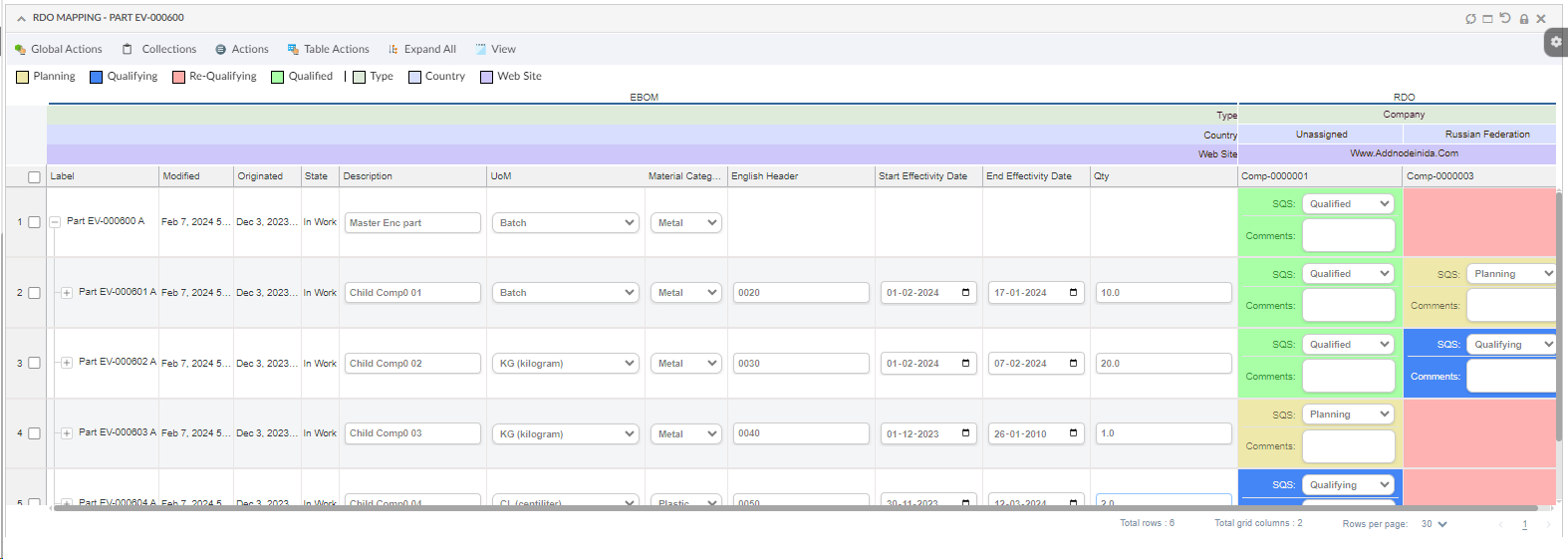
Figure 1. Toggled Edit Mode
|
|
||
ToggleEditSelectedElements |
Navigates to a widget where selected intersection elements which have a valid connection are loaded.
|
|
||
ToggleEditAllElements |
Navigates to a widget where all the intersection elements which have a valid connection are loaded.
|
|
||
ToggleEditColumnObjects |
Navigates to a widget where grid column objects are loaded.
|
|
||
ToggleEditRowObjects |
Navigates to a widget where grid row objects are loaded.
|
|
||
ExportExcel |
Preconfigured command that exports the rows of the table to Excel format. Use the |
|
||
ExportPDF |
Preconfigured command that exports the rows of the table to PDF format. |
|
||
ExportCSV |
Preconfigured command that exports the rows of the table to CSV format. |
|
||
Collection |
Adds a collection menu with below commands to manage businessobjects in Clipboard and Collection. Refer collections section for more details |
|
||
FilterChooser |
Preconfigured command that filter data in the existing table rows or in full structure. Filter can be applied for a particular field or any field. After data is filtered, cells of filtered data based on search term are highlighted accordingly. Multiple column filters can be added to narrow down results further. Users can add additional filter rows using the Add button, each targeting a specific column or Any Field. Each filter row allows selecting a column, an operator (contains, is, is not, is empty, is not empty, not contains), and a value. Filters can be removed individually or all at once using the Remove All button. 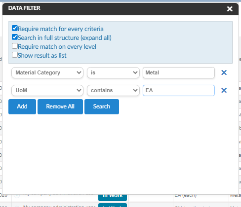
Figure 1. Data Filter - Multiple Column Filters
When multiple filters are applied, the following options are available:
After a filter is applied, the results bar displays the matched hits along with the filter criteria. An
|
|
||
AdvanceSorting |
Preconfigured command that enables multi-column sorting on the grid browser table. Users can sort data by up to three columns simultaneously, each with an independent sort direction (ascending or descending). The sort configuration can optionally be saved for future sessions using the Save Sort checkbox. 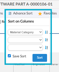
Figure 1. Multi Sort
This command can be configured in the toolbar as below: |
|
A goBack button will be available in the toolbar of toggled widgets to go back to main grid browser widget.
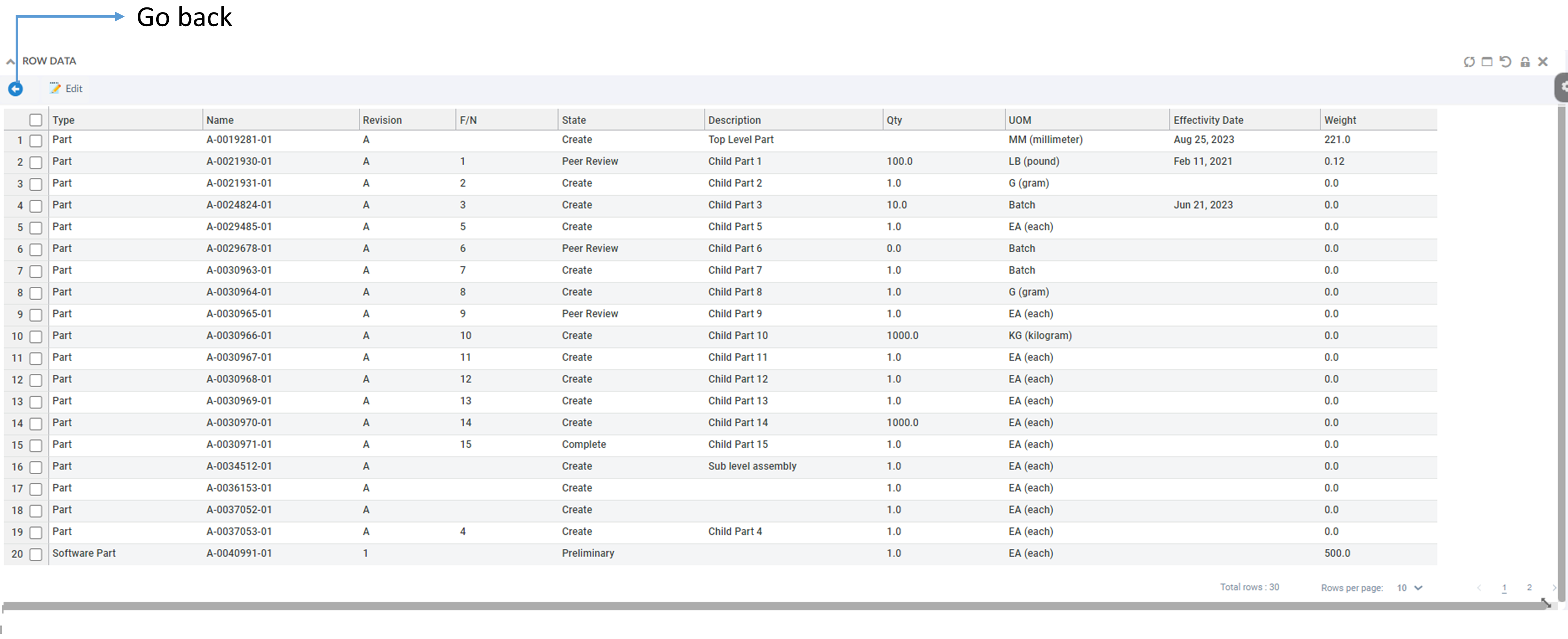
Figure 1. Toggled widget
The widget that needs to be toggled are to be added the respective dashboard as shown below.
<Dashboard>
	<Locked>false</Locked>
	<Floating>false</Floating>
	<Widgets>
		<Widget namespace="hex:engineering:grid" name="GridRDOMapping.xml">
			<Id>gridRDOMapping</Id>
			<Width>12</Width>
			<Height>8</Height>
			<X>0</X>
			<Y>0</Y>
			<Locked>false</Locked>
			<Badge>false</Badge>
		</Widget>
		<Widget namespace="hex:engineering:grid" name="GridColumnObjects.xml">
			<Id>columnObjects-goThere</Id>
			<Width>8</Width>
			<Height>10</Height>
			<X>0</X>
			<Y>0</Y>
			<Hidden>true</Hidden>
		</Widget>
		<Widget namespace="hex:engineering:grid" name="GridRowObjects.xml">
			<Id>rowObjects-goThere</Id>
			<Width>8</Width>
			<Height>10</Height>
			<X>0</X>
			<Y>0</Y>
			<Hidden>true</Hidden>
		</Widget>
		<Widget namespace="hex:engineering:grid" name="GridAllElements.xml">
			<Id>allElements-goThere</Id>
			<Width>8</Width>
			<Height>10</Height>
			<X>0</X>
			<Y>0</Y>
			<Hidden>true</Hidden>
		</Widget>
		<Widget namespace="hex:engineering:grid" name="GridSelectedElements.xml">
			<Id>selectedElements-goThere</Id>
			<Width>8</Width>
			<Height>10</Height>
			<X>0</X>
			<Y>0</Y>
			<Hidden>true</Hidden>
		</Widget>
	</Widgets>
</Dashboard>| Ids of the toggled widgets should be same as mentioned above. |